American Medical Association Homepage Redesign
Project:
One of the main goals of the American Medical Association's web site is move potential members into the membership funnel through the introduction of curated content and insight into today's medical world.
After traffic increased on the AMA's site two fold in 2020, from 11MM in 2019 to 22MM in 2020, the Marketing and Member Experience (MMX) team decided it would be a benefit to develop the following products, and updates, for the home page:
→ Develop a trending index
→ Redesign hero editorial section
→ Overhaul doctor focused section into a spotlight for AMA Ambassadors
→ Develop an Annual/Interim meeting module
→ Develop a podcast module (still in development)
Challenge:
We had to figure out a way to develop the requested list of items for the year without hindering the overall design or impeding upon American Medical Association membership growth.
My Role:
I was the Lead UI/UX Researcher/Visual Designer throughout the project cycle from researching solutions, reviewing on-page analytics, interviewing SMEs, wireframing solutions, and delivering high-fidelity layouts. Also, I collaborated with the development team to brainstorm ideas and problem solve issues.
Interviews:
At the very outset of the homepage redesign, I set forth with my team to interview Subject Matter Experts and business stakeholders in order to unearth the needs of users and the business strategy behind the redesign. What we learned from these interviews were that users were looking for ways to digest content and do their AMA business with less friction. An example would be the building of a module for the annual and interim meetings where one could find all the information concerning these events. Previous to the idea of a focused module, all of said annual and interim meeting information was spread through the editorial layout, causing friction for these users. Added to this, we found areas on our homepage where content was stagnant. So, we reached out to the social team with an idea of using our Ambassador Program and social channels to make this space more lively. In conclusion, even though we could not met with our members directly, working physicians, we garnered enough information internally in order to set the course for our product delivery.
Lorem Ipsum
Research:
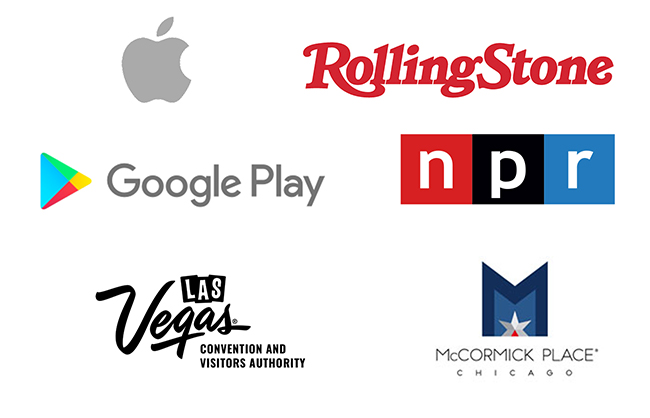
Our research covered the gammut of websites as we needed a broad view for the scope of work we were undertaking. In order to figure out how a trending index would possibly fit into our layout, we looked to media companies like Rolling Stone, The New York Times, and The Guardian. We dived into how they indexed their articles in order to learn how we could replicate the concept within our own taxonomy. The same held true for developing a podcast module. We reviewed how The Guardian was spotlighting these on their home page and then looked to National Public Radio in order to see how they indexed their library. Lastly, The Las Vegas Convention and Visitors Authority and McCormick Place Chicago was important to our annual in interim module as we dug into their client's websites in order to review how they announced their events.
The weekly meetings I scheduled for my team to collaborate during the 10 month duration of this project allowed us to share our thoughts of the findings I presented and discussed what might or might not work within our Information Architecture.
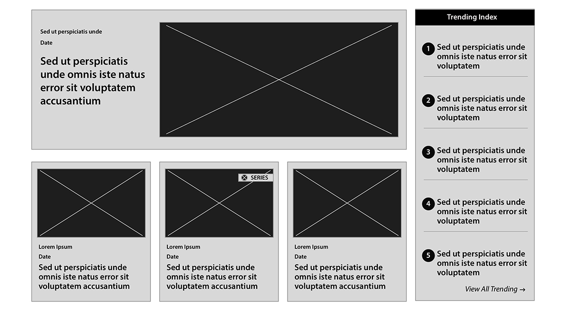
Trending Index Wireframes:
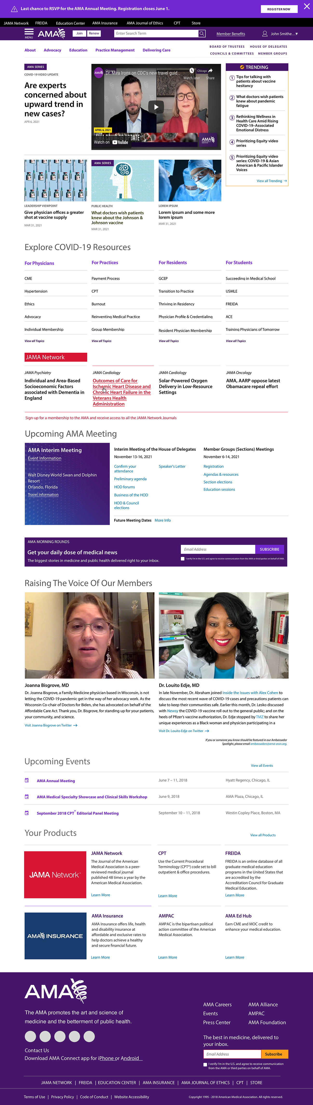
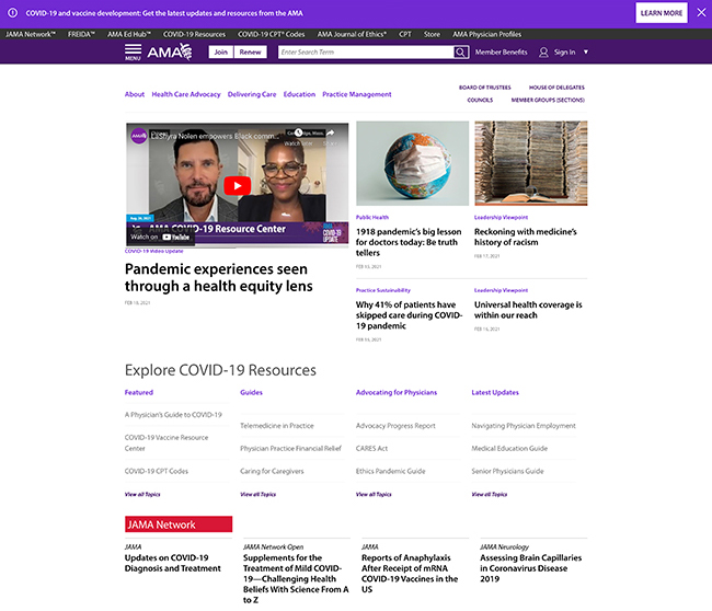
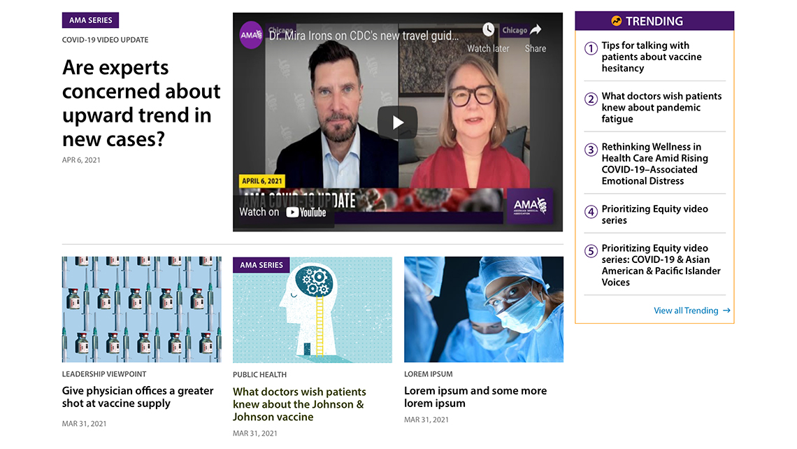
The trending index was the lead project for the home page redesign for the simple fact that we wanted our users to know what content was getting the most traction on the site. Since the top of the home page is dedicated to editorial, we knew we were missing out on best practice of trending. We looked at whether we should trend by subject or by article. In the end, it was by article because we felt we could attain a higher engagement than users just clicking on trending indexed terms as found on sites such as CNN.com or Newsweek.com.
Trending Index High Fidelity:
When we delivered the high fidelity Trending Index to the business stakeholders and to the editorial SMEs, we noticed that we had a chance to redesign the hero and subsequent article stubs. The redesign, in tandem with the trending index, now allowed editorial to have nine slots of content compared to five in the current version.
MMX Social Module Wireframes:
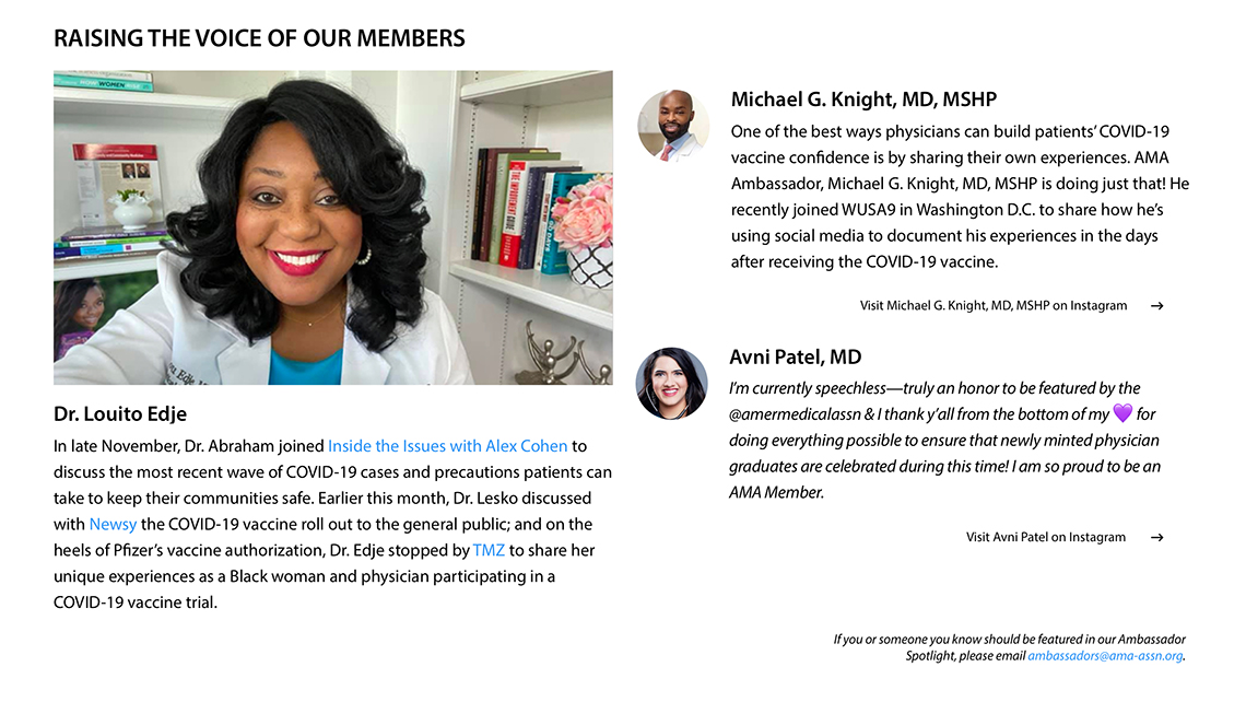
During the COVID pandemic, we reconfigured our doctor focus section
onto those working on the front lines. What we did was upload images of doctor members wearing PPE and masks in order to show visitors to the site that we stood by our members. Unfortunately, we never updated this section and therefore it became stagnant until we started brainstorming ideas. We came up with a concept featuring our AMA Ambassadors, a group of members who are ambassadors for the AMA in the workplace and on social media.
We developed the overarching concept and put together a couple wireframes for review with the social content team.
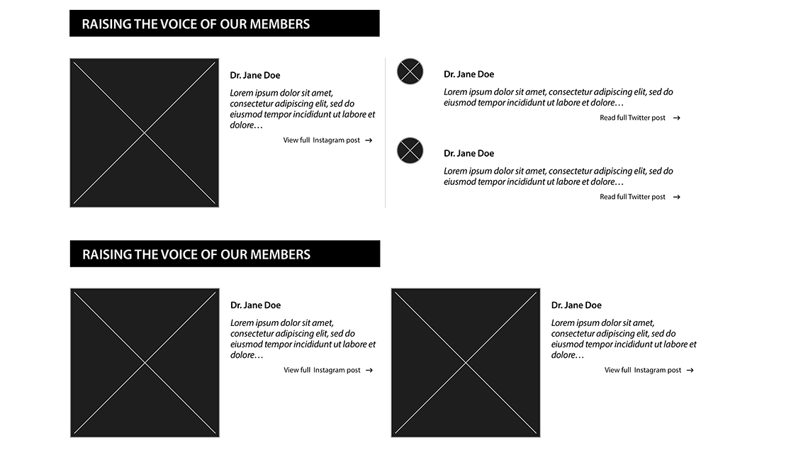
MMX Social Module High Fidelity:
Sharing our initial MMX social module wireframe with the social content team opened up the world of possibilities with them as we could feature the AMA Ambassador of the month on the homepage, which would have been simultaneously announced in an e-mail, plus we would tie in any of our ambassadors using their social channels for AMA benefit.
Before development, we A/B tested the module against the current membership section
featuring our doctor members in their PPE and discovered an uptick in engagement without hindrance on membership.
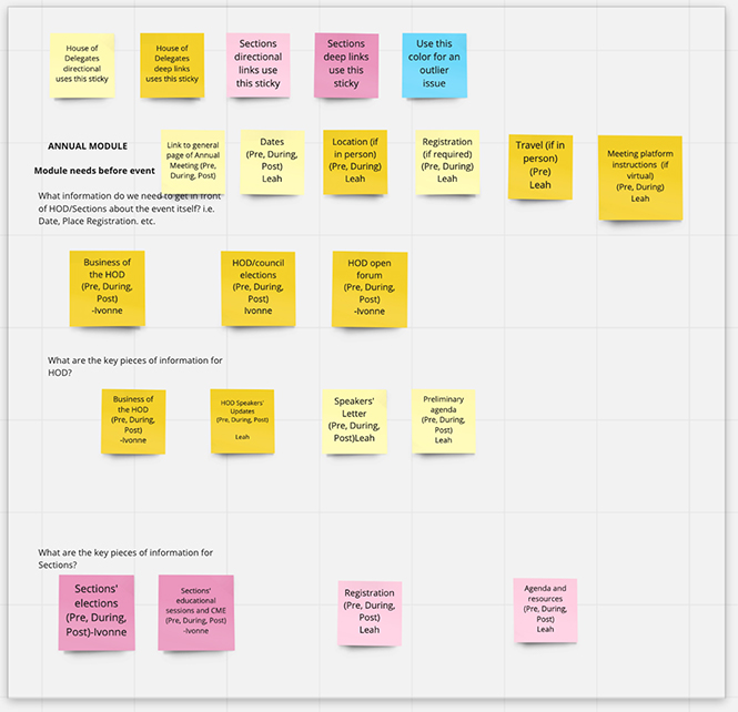
Annual/Interim Module White Boards:
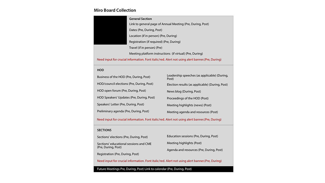
The Annual / Interim Module was the real 800lbs gorilla in the room as the Content Operations Team had to use the current homepage layout in order to announce, share and update the House of Delegates and Section Members before, during and after these meetings took place using editorial slots.
In order to find a solution to this complex problem, we decided to set-up a Miro board and sticky note the needs of each of these distinguished constituents. We felt this exercise would garner insight as to how this module could expand over the duration of the meeting period, allowing users to find all their business needs in one spot.
Annual/Interim Module Journey Map:
Once we had the Miro board with the sticky notes completed, we now had to create a journey map by which users of the module would navigate the AMA site. The journey map would help us understand how content was placed within the architecture of the site and give us insight on how to decrease friction for the user. The one caveat to this project was we were not allowed to break architecture. Therefore, we relied heavily on our taxonomist to figure out how we could create category pages that would fall in line with the site and assist the end user.
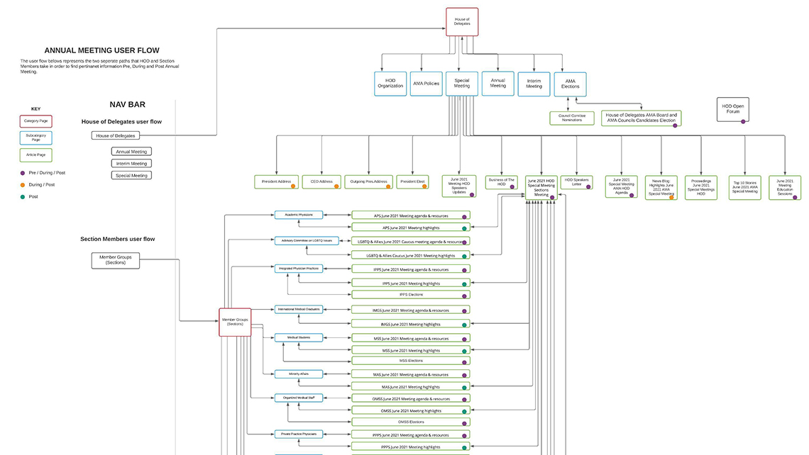
Annual/Interim Module Wireframes:
Working through the Miro board and journey map, we were able to flesh out wireframes that would assist us in discussing with the Content Team ways to solve a users way finding for the information they needed when it came to the AMA's annual and interim meetings. The wireframes opened the discussion on how the CMS would work in all three scenarios that we were solving for - pre/during/post meetings.
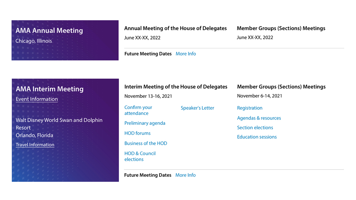
Annual/Interim Module High Fidelity:
The delivery of our high fidelity Annual/Interim Meeting module to the content team was welcomed in our design review. With my team, I walked through the module focusing on how each of the constituents they were speaking to, including future members visiting the site, would interact and garner the information they needed pre/during/post meeting.
Business Feedback:
What we set out to accomplish in 2021 was a staggering list of items to implement and release for the American Medical Association's homepage. During the course of this project, which lasted 10 months, we received feedback from various sectors of the AMA which had nothing more than high praise for the evolving product. Even more gratifying is that we increased membership by 8% while decreasing the friction on our users, who find us by organic search 70% of the time.
Please visit the redesigned home page here.